 | |
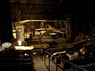
| Monday: The set looks sparse, with only the first tier of scaffolding, a free-standing door, and some fake brick facades scattering the stage. |
 |
| Tuesday: The set looks beautiful with its multiple levels, hung windows, painting, and lighting. Still at work in this shot, but looking much more similar to Kathryn's design plans from our previous post! |
Come see it for yourself this Sunday at the opening of RENT!


No comments:
Post a Comment